The backgrounds in older seasons of the animated series Arthur featured real water colour images. I recently had the opportunity to work on the series. It was my job to replicate that painted-feel digitally for season 18 of the show.
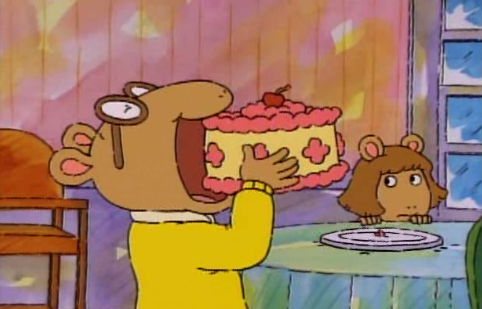
To start every artist on the background team was given a style guide to work from. This included how to set up files for the animators, which digital brushes to use, notes on how to keep the image looking light (not to muddy or streaky), picking a light source and adding the tell tale conté crayon lines to the finished painting to really give it that “Arthur” feel.
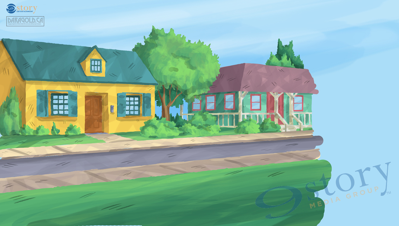
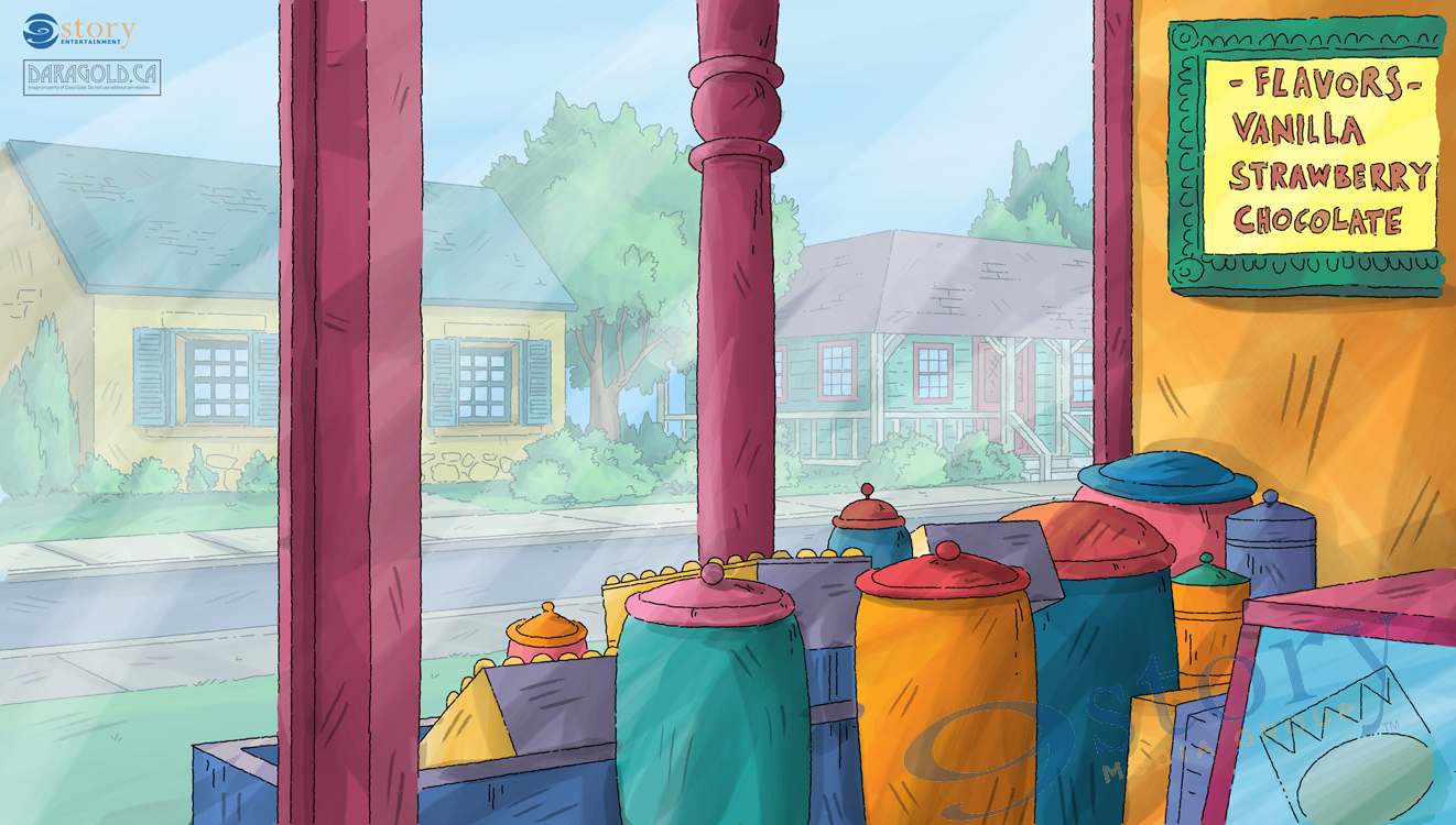
The painting I’m going to walk you through is a shot from the interior of a store looking out onto the street. The characters are seen through the window. To make this work the interior (overlay) is painted first. Once complete both the interior and exterior backgrounds (underlay) are kept as separate layers within the animation program so that the characters can be animated in between them. Think of the layers like a sandwich. The overlay is the top piece of bread, the animation is the yummy filling and the underlay is the bottom piece of of the sandwich.
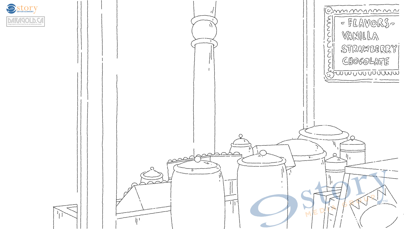
Every background starts with the line art from the layout department.
The first step for the painter is to block in the base colours. For this background I was tasked with matching an existing background from an older hand-painted season. I picked the colours from the existing painting to match it as closely as possible. The blocking stage is also when you clearly define areas of light and shadow. I chose the outside to be the source of light. I also made sure to keep the paint for the window pane set at a low opacity so that the characters and underlay could be seen through it. This will become evident in the later stages of the painting.
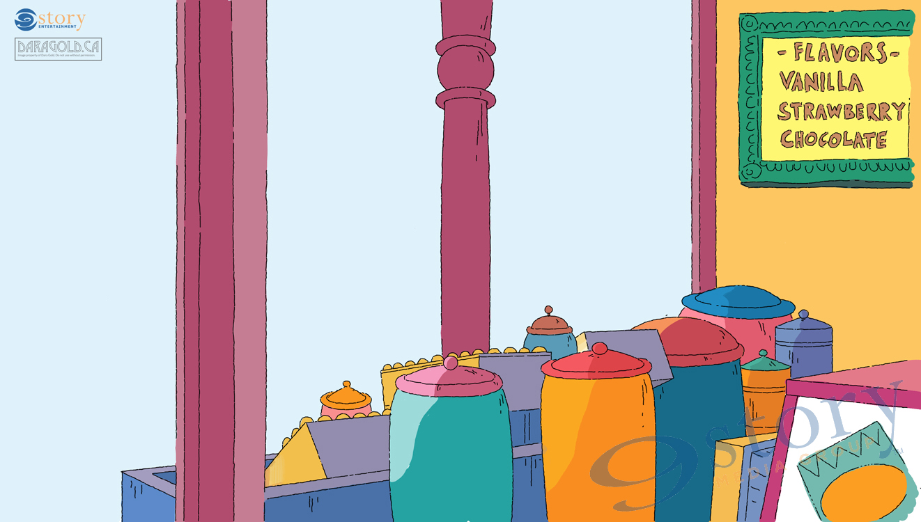
Once the base colours are added it’s time to start texturing. All of the flat colours get painted over with a combination of digitally created water colour brushes. I like to pick a slightly lighter and darker tone of each colour and brush them over the top of the flat paint. To make the image feel like water colours it was important to emphasize the light tones on every colour. On Arthur this was often achieved with lots of layering, leaving triangle shapes of the base colour showing through. This replicates how the tone of the paper adds highlights and softness in hand painted watercolours.
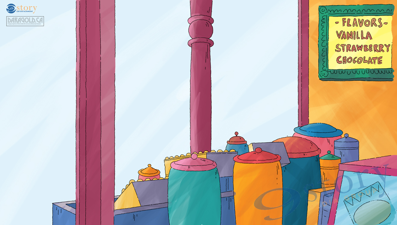
The final step is adding shadow and conté lines. I love this part of the painting process because the whole image really starts to come to life! This is achieved by adding in the cast shadows on all the surfaces, and really emphasizing those triangles of light. The final signature Arthur touch is adding the conté crayon all over the image. The conté colour is created on a separate layer on top of all the paint. I used black set at a low opacity so that it would stand out and pick up the tones of the painting underneath.
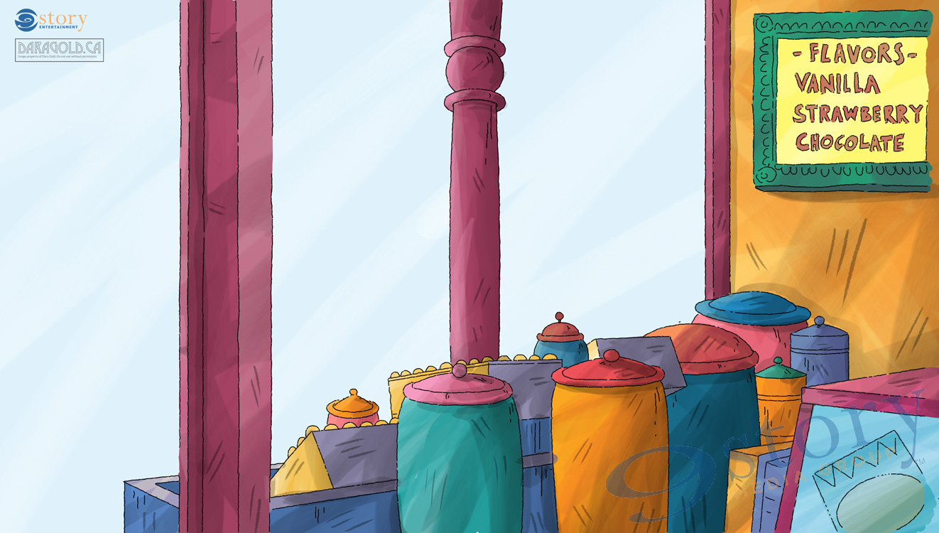
Here’s what the painting looks like without the layout drawing imposed on top. Hiding the drawing is a great way to check and see that the lights and darks are fully realized. The painting shouldn’t look flat without the line work.
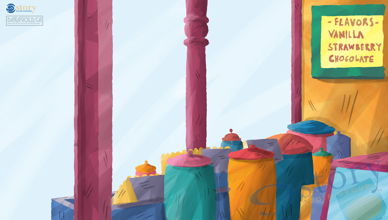
And now for the underlay! Same as before it starts with the layout drawing.
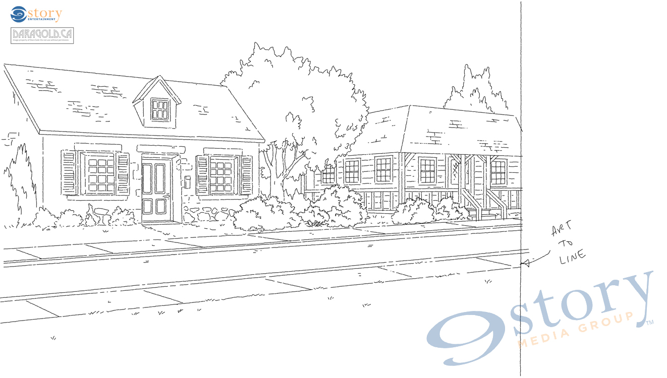
Then the colours are blocked in, paying close attention to areas of light and dark.
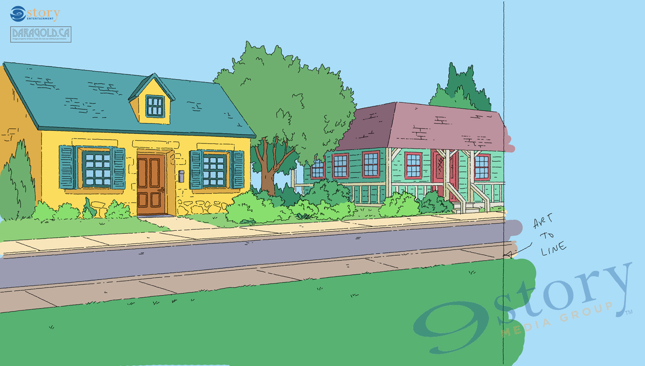
Texture texture texture! Build up the layers with multiple shades of the base colour and leave triangles EVERYWHERE.
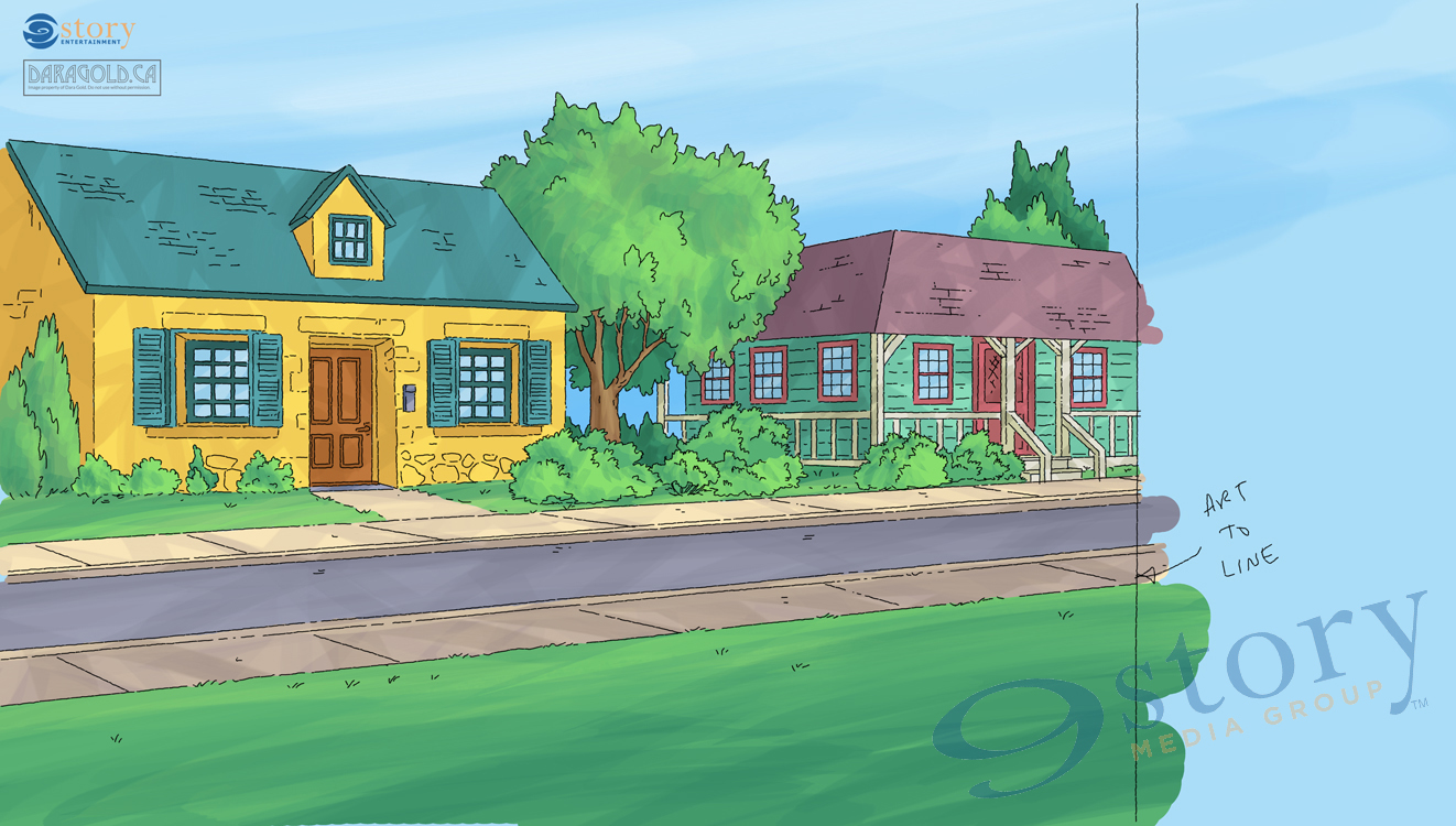
The best part – shadows and conté lines!
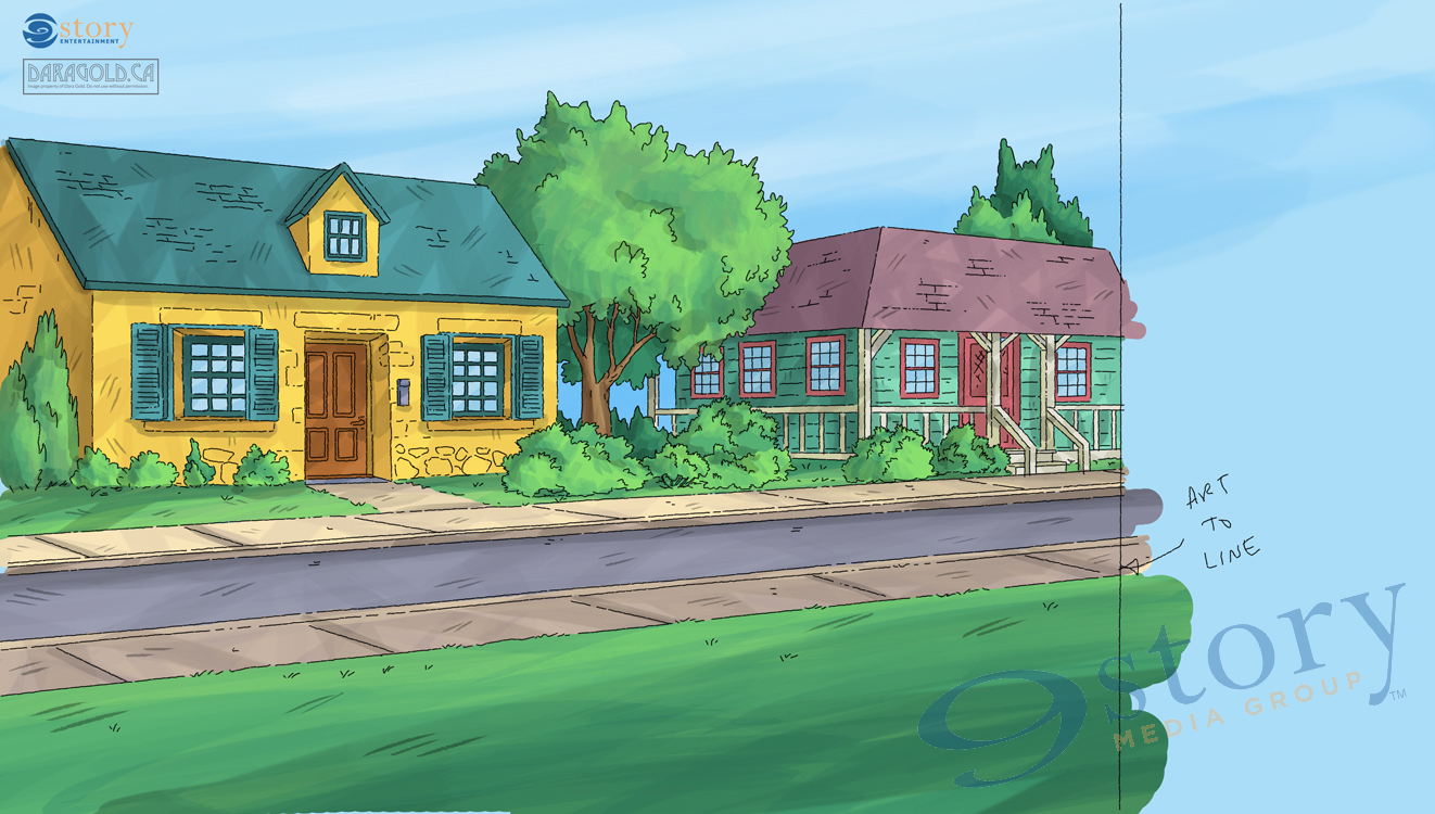
Once last check to make sure the painting looks good without the line work.
And finally we can see the complete image, with the overlay (and lower opacity windows) on top of the underlay. The painting is now ready to send off to the animators.
I hope you enjoyed that little foray into backgrounds! I hope to share some more step by step posts in the future.
Until then you can keep up with me on Facebook and Twitter. I also have an online shop where you can find art prints and mugs oh my!
Until next time,
Dara
I’m super excited to announce that I will be tabling in the Artist Alley at this years Niagara Falls Comic Con! It will be the first convention I take my wares to outside of Toronto – so I’m crossing my fingers that it’s the start of traveling to a lot more conventions across Canada and beyond!
You can find out info about all the amazing artists here.
The Convention takes place Friday June 5th through Sunday June 7th at the Scotia Bank Convention Centre in Niagara Falls Ontario.
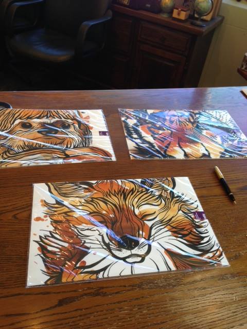
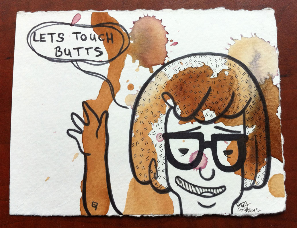
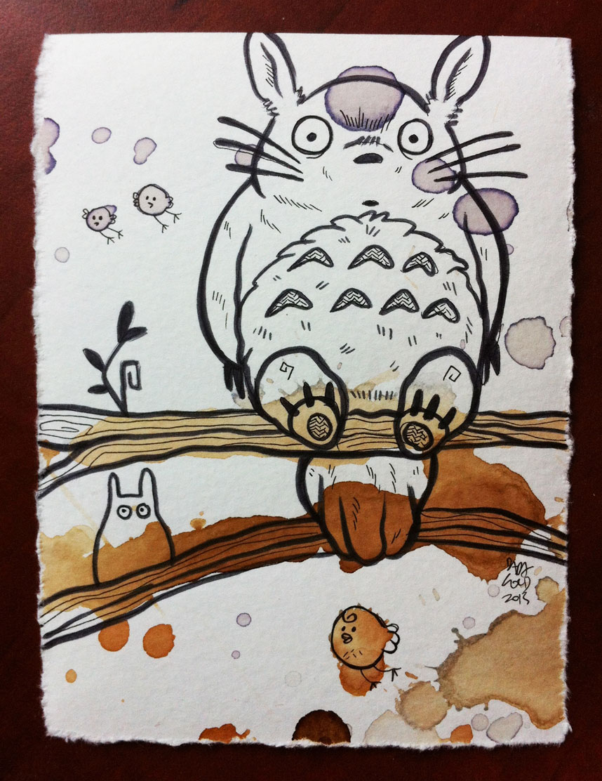
I’ve restocked my animal tea stain posters, and I’ll be debuting a large tea sloth poster print at the show.
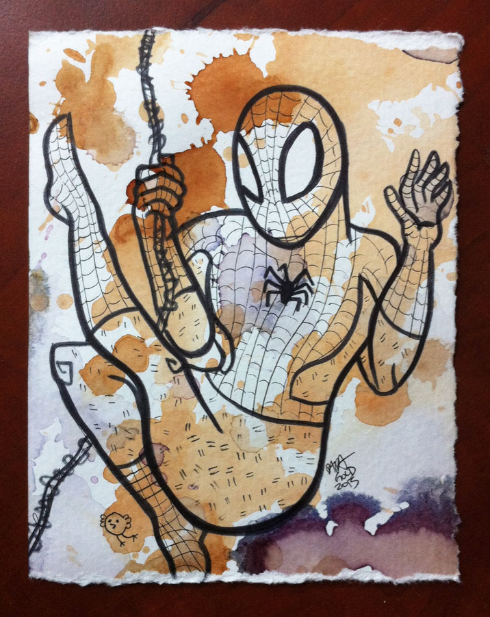
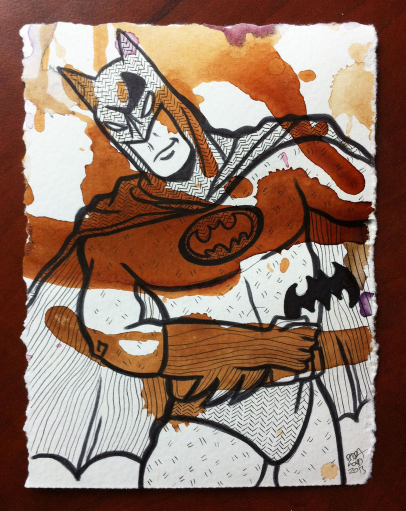
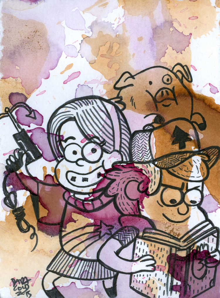
There will also be a whack of new fan art mini teas.
I’ll have posters, prints and postcards. Shiny things, mini teas, big tea stains and on the spot commissions.
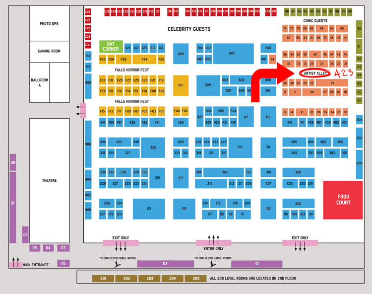
Tea art galore will be at table A23. And on top of that, on Sunday I will be giving a talk on Art Direction in Indie video games! So if you happen to be at the show, come out say hello and ask questions about games, how to get into them, or what exactly an art director does for independent games.
The full floor plan and schedule for panels and talks can be found here.
And last but not least, here’s a video preview of the show!
Hope to see you there!
And as always you can keep up to date with me on facebook, twitter and on my Society 6 store.
Spring is around the corner, and that means it’s the start of convention season! I love comic book conventions and I cannot wait to spend time amidst the many talented illustrators and artisans in the Artist Alley. If I could say only one thing about Toronto it would be that we have one of the best Artist Alleys to be found at any comic or pop culture convention. So even if you’re not that into comics, or the plethora of guests who will be making an appearance, come out for the indie artists. You won’t be disappointed!
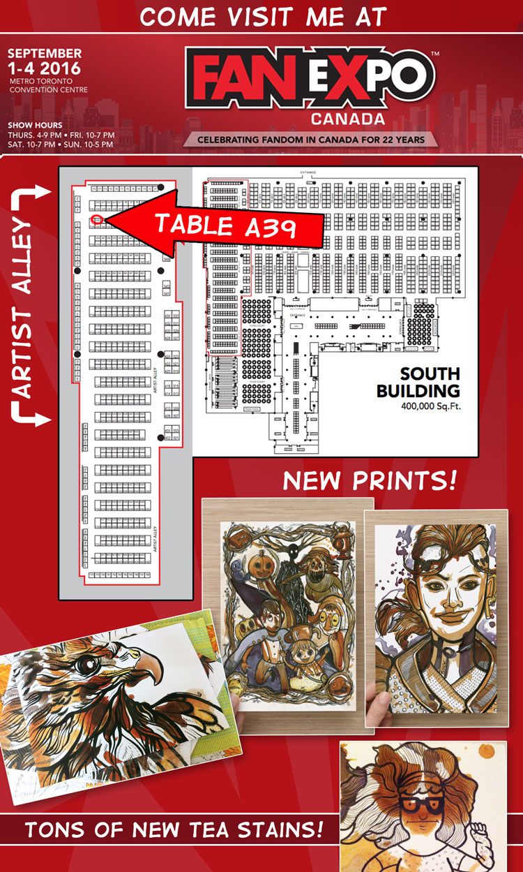
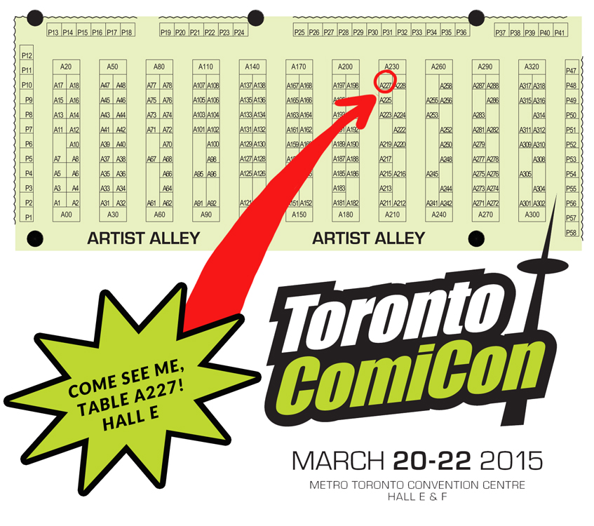
You can come visit me March 20th -22nd at Toronto Comic Con 2015. I’ll be at table A227 in Hall E.
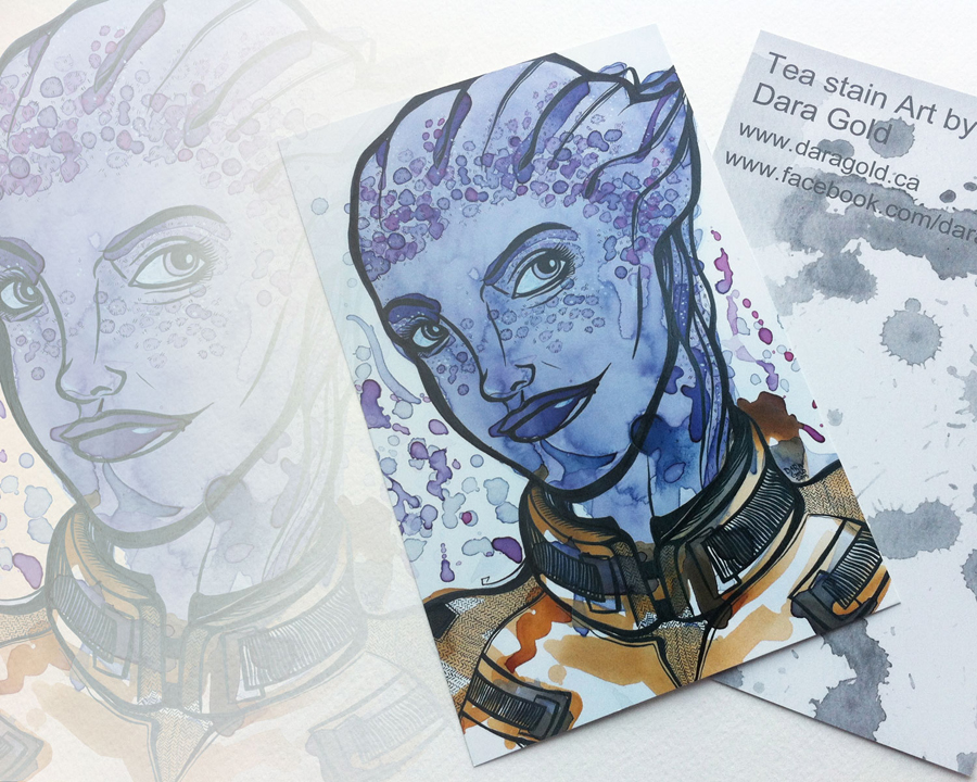
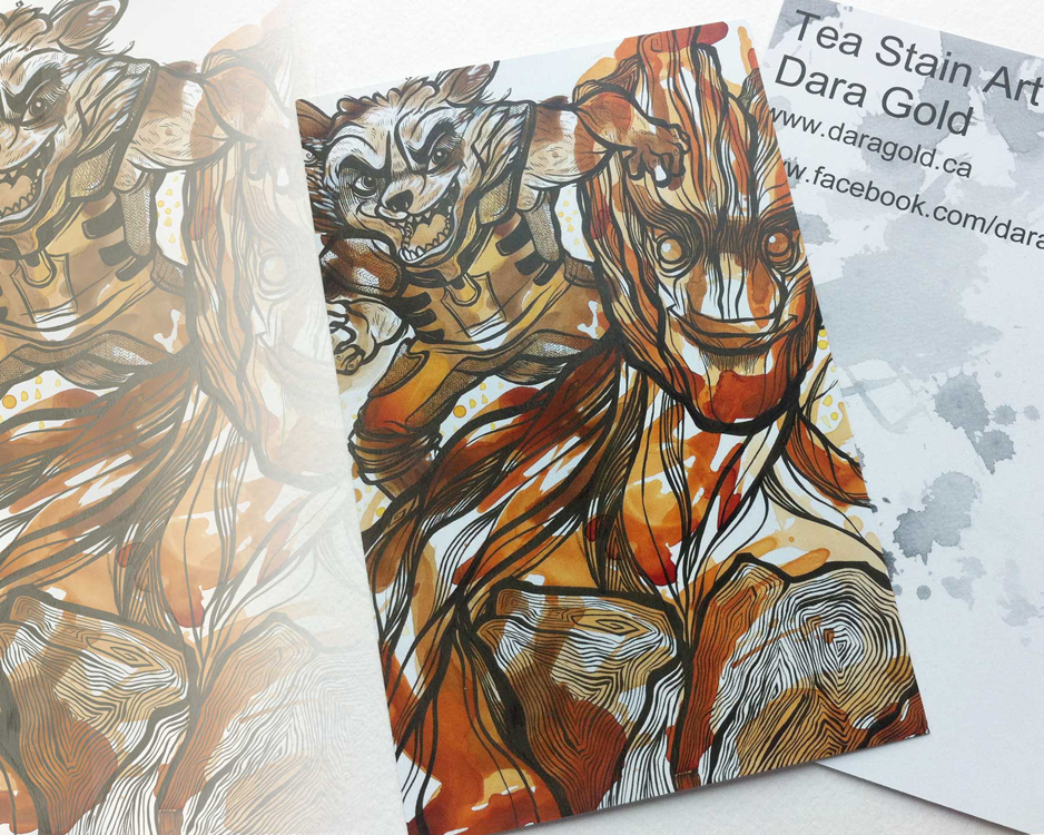
I will have new goodies, fresh from the printing presses and tea pot. My newest Mass Effect and Guardians of the Galaxy glossy post card prints have arrived.
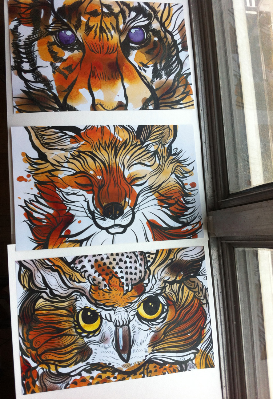
I’ve also printed brand new posters of some of my animal tea stains. 11×17 inches of glossy goodness!
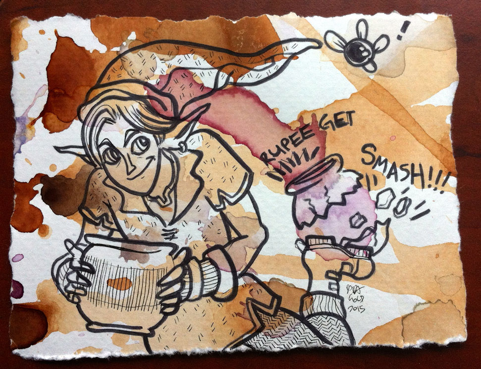
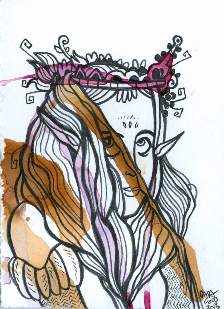
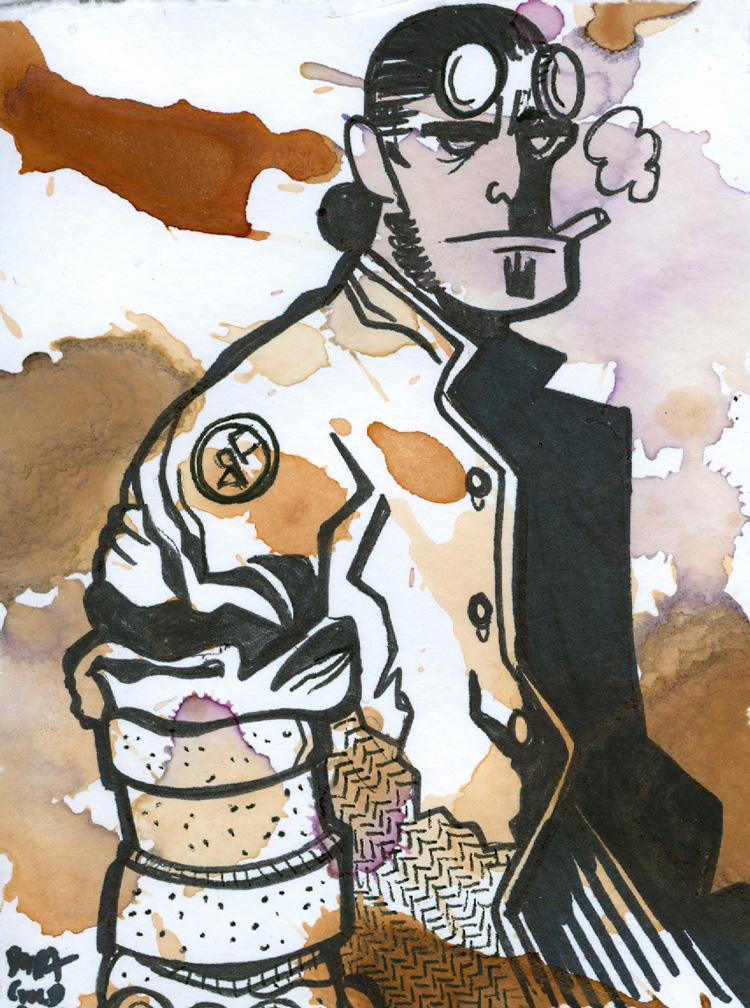
And I’ve made a slew of new mini tea stains. Some based on pop culture, and others totally inspired by the shape of the tea.
So if you’re at the con, come say hello! I have so many new things to share with you.
And as always you can stay in touch with me and keep up to date on current art on my facebook and twitter. I also have an online store with pillows, mugs tote bags and more.
Super exciting news!
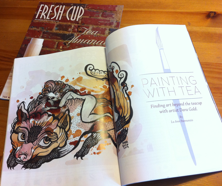
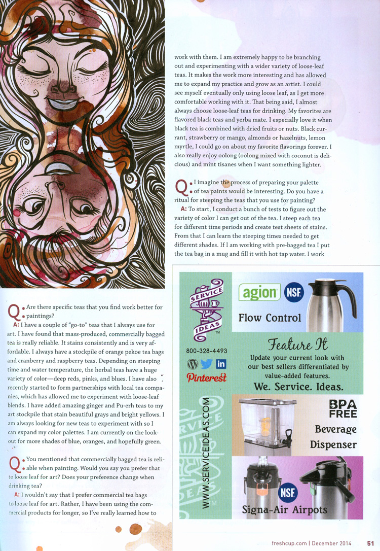
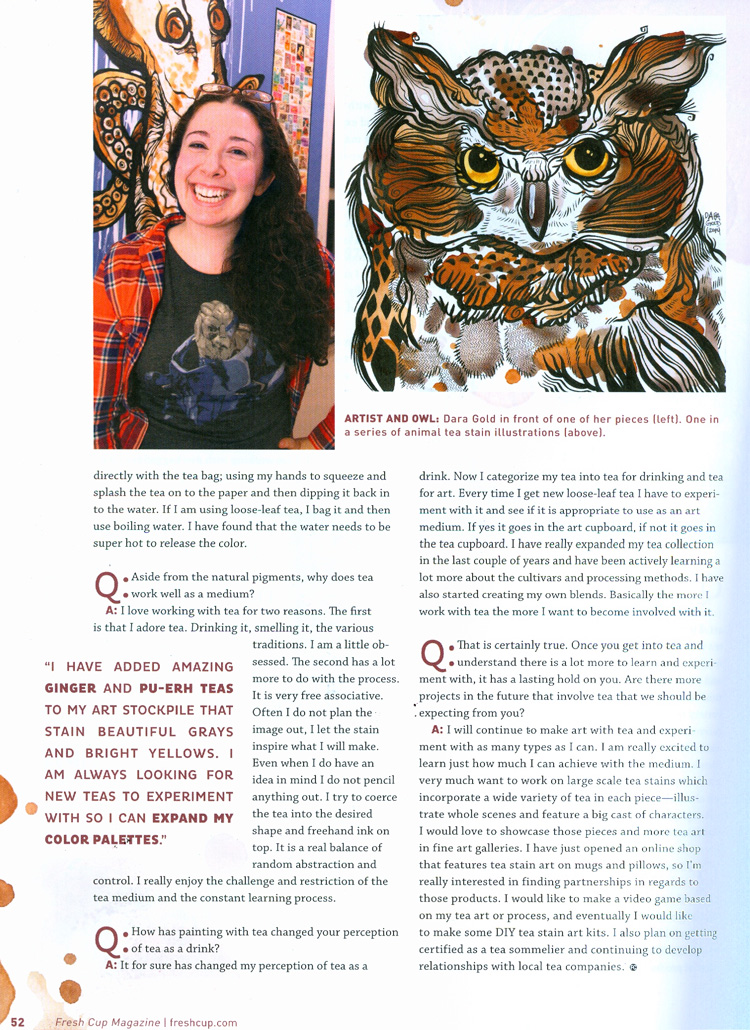
In December Fresh Cup Magazine released their 2014 Tea Almanac.
Fresh Cup has spent the last two decades covering stories that specialize in coffee and tea. Featuring growers, retailers, blends, small tea & coffee shops and tea artisans.
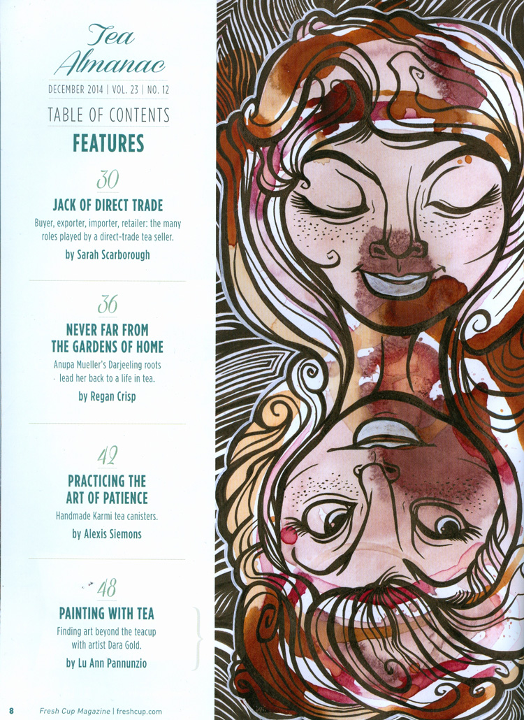
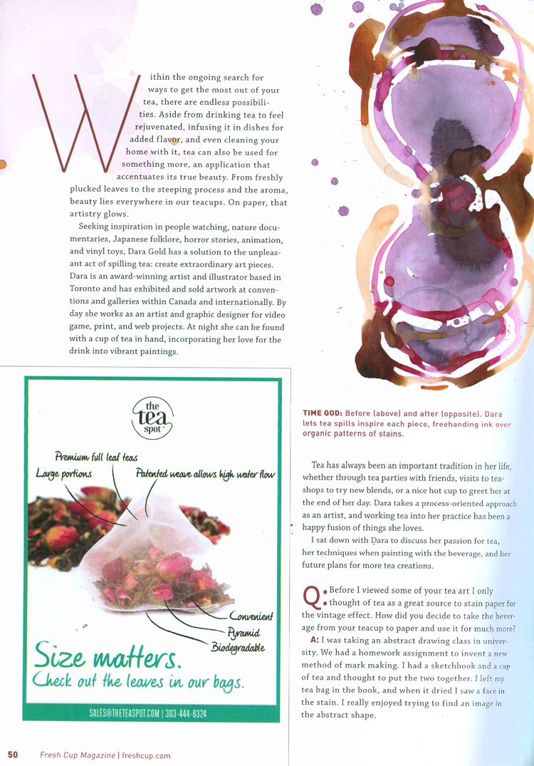
I’m overwhelmed by the fact that my art and an article about my tea stain process was one of the featured articles in the 2014 iteration of their annual issue devoted entirely to tea. I was interviewed by the lovely tea blogger Lu Ann Pannunzio of The Cup of Life.
Make sure to check out more of Lu Ann’s writing over on her blog. You’ll find tea reviews and a plethora of other tea based goodies. If you want an even deeper dive into the world of tea, consider subscribing to Fresh Cup Magazine.
And as always you can stay up to date with me online.
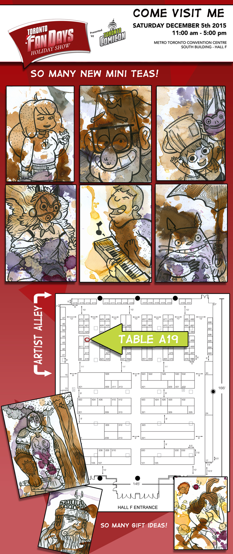
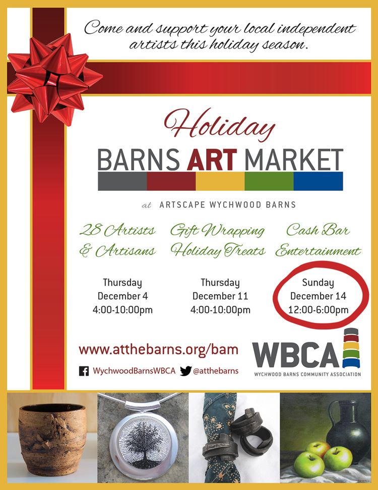
Tis the season for… HOLIDAY ART MARKETS!

