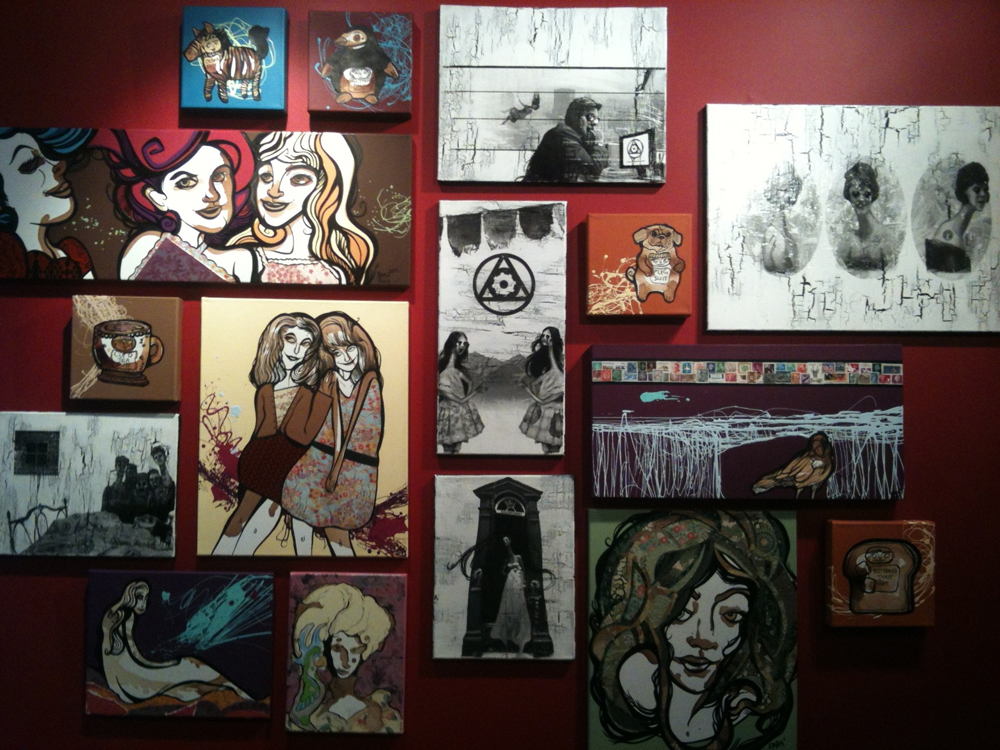
I’m super excited to announce that I will have my artwork on display at Elephant Shoes for the next few months!
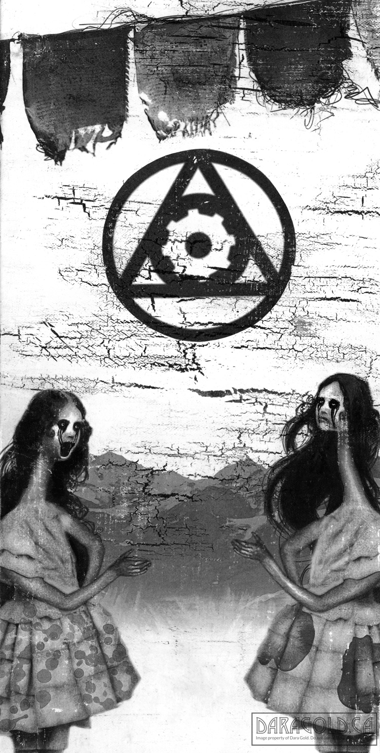
This is the first time I will have my Visitations (the black and white pieces) artwork on display since the conclusion of the play that they were created for. They’re a real diversion from my usual style and allowed me to explore the creepy sensibilities that underscore a lot of what I do.
I’m over the moon with how the show came together. I think the intermingling of the two series really works. Sometimes you think something makes sense in your head, but you need to see it in the space to believe it.
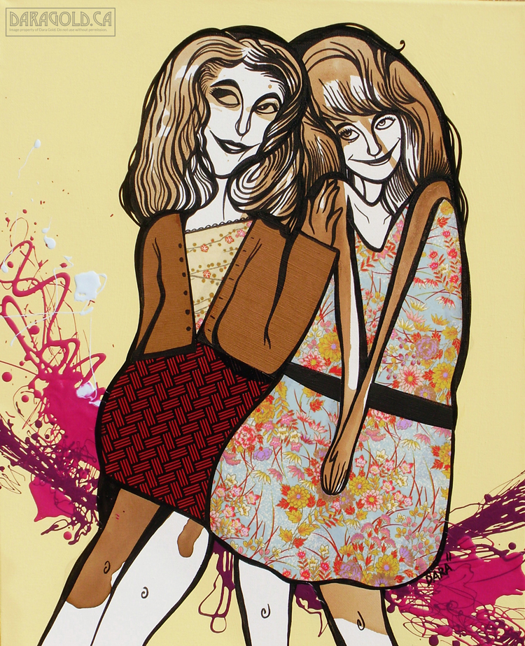
Many of my paintings are portraits of women, or young girls whispering secrets to each other. It’s neat to see how my “go to” themes carried through seemingly disparate works.
If you want to see the show in person swing by Ransack The Universe (1207 Bloor Street West Toronto). Elephant Shoes is housed inside. You’ll find stained glass, hula hoops, art workshops, vintage and totally random goodies, and of course art! Traversing the aisles of the store to get to the show is a bit of an adventure in itself and highly recommended.
You can find out more about Elephant Shoes on their facebook page.
Want to stay in the loop with me ? Head on ovet to www.facebook.com/daragoldart
Need tea stain mugs or other classy home decorations? I’ve got you covered. http://society6.com/daragold
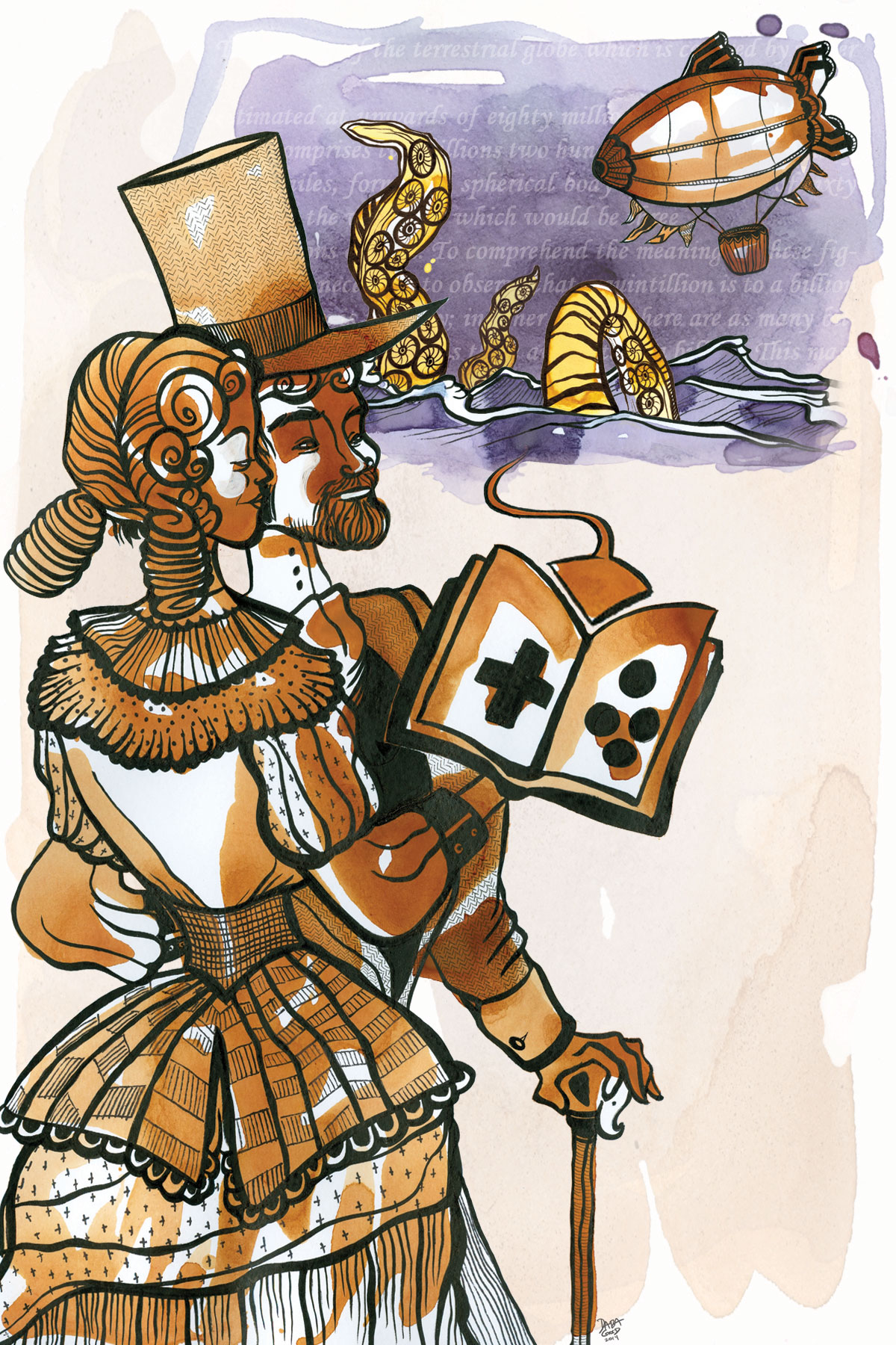
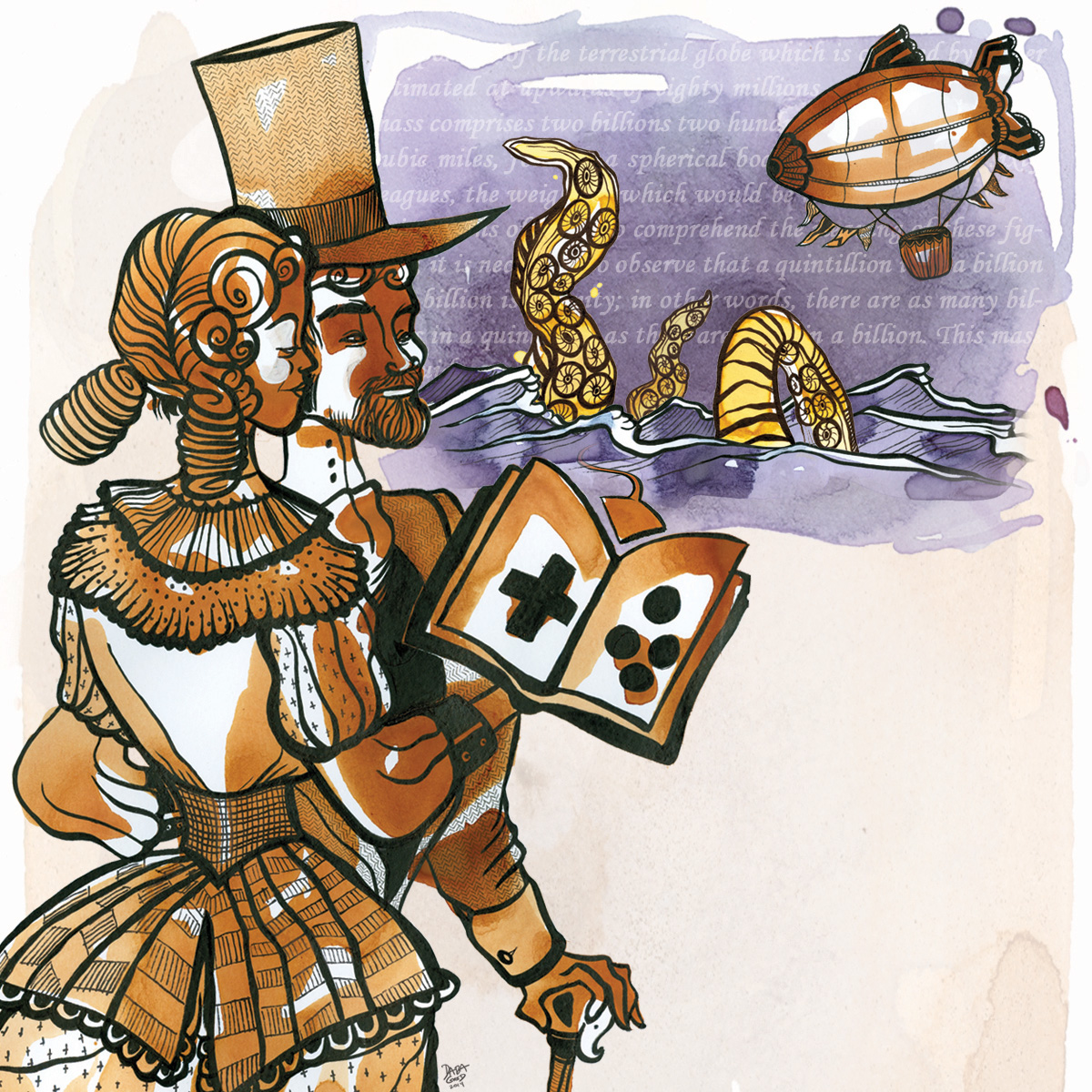
I was recently asked by the Hand Eye Society to create a tea stain illustration for the upcoming WordPlay festival. I’m extremely excited about the final image and I want to share the process of creating it with you!
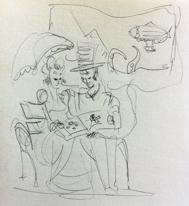
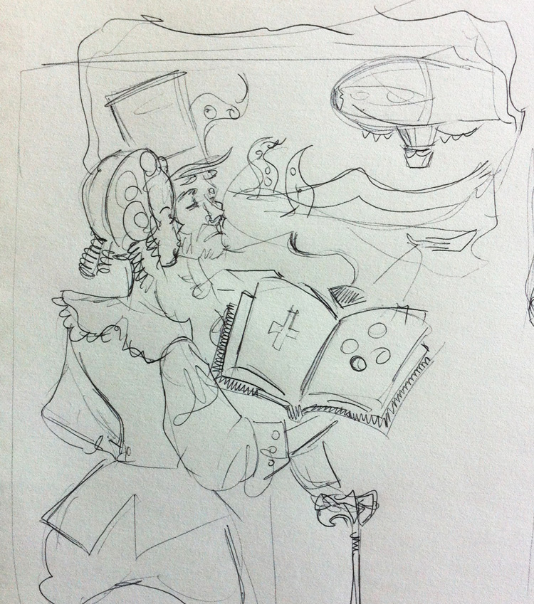
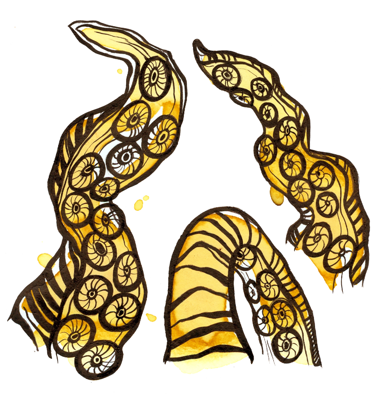
The first step in creating the tea stain was to draw some thumbnail sketches. Unlike many of the tea stains I create, this one needed to be planned out. After the first round of sketches it was decided to take a more visually Victorian approach. I came up with a couple using the WordPlay logo to engage on a journey featuring a dirigible and Kraken tentacles. You can almost never go wrong with dirigibles and tentacles.
We decided to go with the second sketch.
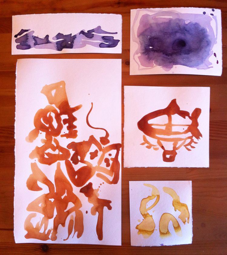
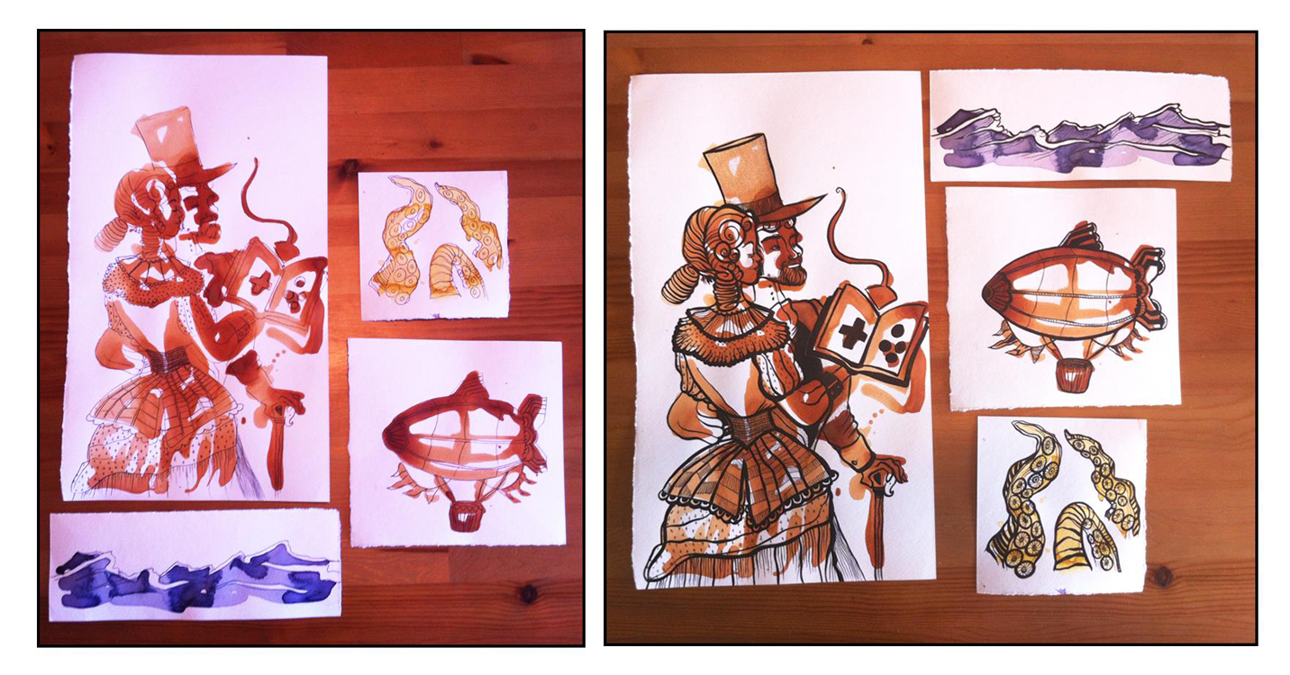
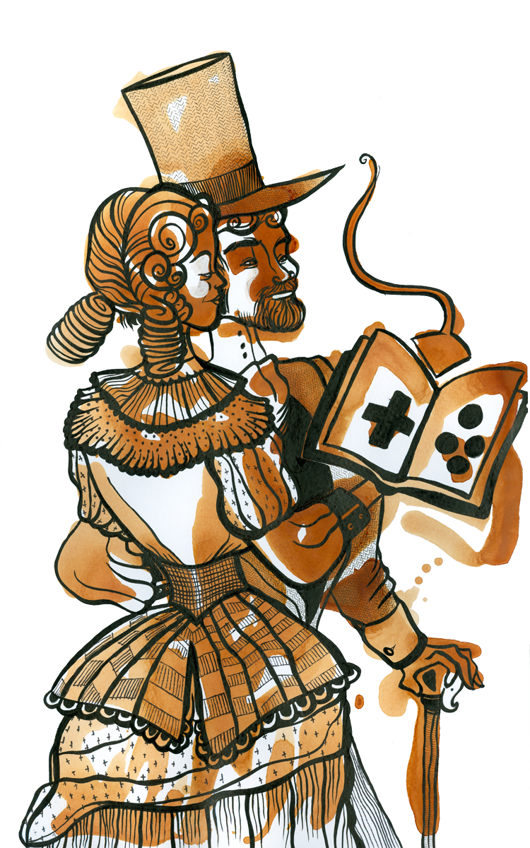
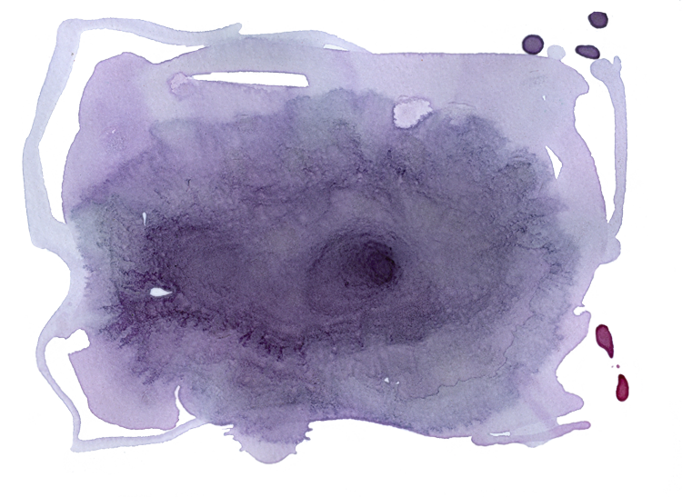
The next step was to mentally break the image into pieces and decide how many teas I would steep and how many stains I would make. I decided to create a composite image (all of the pieces created individually and digitally composited for the final) to give me the freedom to play with the composition and make each visual element clear. I used Orange Pekoe, Cranberry and Ginger tea to create the 5 parts of the image.
I don’t pencil out my tea stains. When I have an idea in mind I set up my reference materials ( my sketch or a photo) next to my work space and use it as a reference to help guide where I put the tea. The end results are abstract, but oddly specific tea stains.
Once the tea dries I ink in two stages. The first is to use a fine tipped technical pen to “rough” in my line work, and create small patterns. This basically acts as my pencil drawing, which guides the final inking. That being said, I can’t erase anything. Its my freehand inking in combination with the loose shapes of the tea that leads to the final tea stain drawing style.
Once the rough inks are complete I make my final lines with India ink and a brush. I have a couple of sizes that I like to work with, but I just stuck with a #2 brush tip for all of these drawings.
After inking each drawing I scanned them into my computer and removed the images from their water colour paper backgrounds.
Once I have all the pieces ready to go I place them on to the digital canvas (in photoshop) sized for the final image. I don’t really have a picture to encapsulate this part of the process. Basically I just resize and move things around until the whole things matches the sketch and makes a pleasing composition.
I also added some detail digitally. The WordPlay festival is about words, and many of the featured games don’t have any visuals at all. So it was very important to include text in the “game” area of the image. I chose a passage from 20,000 Leagues Under the Sea and overlaid the text in the sky (behind the tentacles). I made the words white and set the opacity to a medium low so the words wouldn’t interfere with the image, while still seeming part of the scene.
I created a 4×6 postcard and 4×4 square for the final image. All that remains is for the Hand Eye Society to add the festival details, and voila tea stain FESTIVAL POSTER!
Want to stay up to date on all my current works in progress? Head on over to my facebook page for projects like this and other art treats!


